
Interlude in Blue # 1 Sacré Bleu
![Madonna_and_child,_londonDomenico Veneziano [Public domain], via Wikimedia Commons](/wp-content/uploads/sites/5/2012/01/Madonna_and_child_londonDomenico-Veneziano-Public-domain-via-Wikimedia-Commons.jpg)
Madonna and Child by Domenico Veneziano around 1440. Note that the browns and greens of the painting have degraded and faded over the years, while the blue remains relatively vibrant (as does the gold, which is real, gold leaf). One of the reasons ultramarine was so prized, was that it did not fade like other plant or metal-based blues.
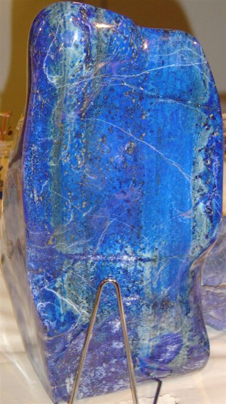
A polished piece of lapis lazuli, from which ultramarine blue is made.
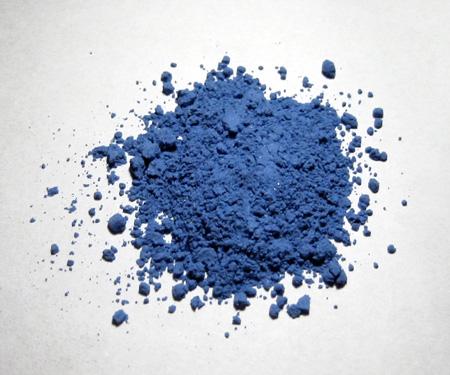
Crushed lapis lazuli, or ultramarine pigment. This photo actually apears a bit duller than ultramarine that I’ve seen in person. It may be due to lighting, or it may be not be finished in the processing.

I just recently finished “Color – A Natural History of the Pallette” by Victoria Finlay.
It is written in a travelogue style and recounts her world travels researching the origins of colors and of dyes and pigments. Very cool if you’re interested in color.
Interestingly, ultramarine was rather tetchy as a pigment for fresco, until modern modifications, and had to be applied a secco, after the plaster had dried: the lime would eat it up otherwise.
And the dried pigment doesn’t betray its brilliance when a medium is applied to it. The light just disappears into it. Lovely stuff.
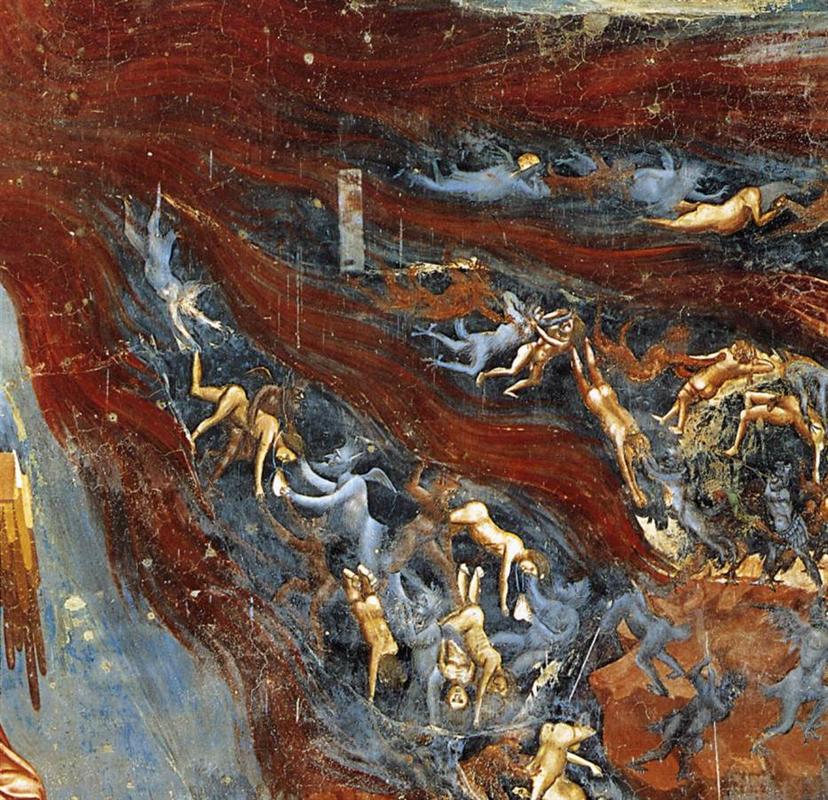
“…in this same painting, Jesus is wearing a robe painted in a much brighter shade of ultramarine, so rather than a function of bribery, Giotto may have been trying to portray the ‘darkness’ of damnation.”
Or maybe a connection between Heaven and Hell, absolution and damnation, as two signs of the same (blue) coin?